Skip to content
MemBuild
All concepts Concept, not a client project
Member app

A training platform with a coach in it

Members follow a weekly plan of strength and martial arts sessions, and send short videos to a coach who answers on the same page.

  • Drawn 15 November 2026
  • 11 screens
  • Placeholder names, logos and content
The brief, in one line

An online training programme where members get a plan from an assessment, train with a timer and videos, and get feedback from a coach.

Who the members are

People training at home or in a gym a few times a week, mixing strength work with Muay Thai drills.

Some only want the plan. Others want a coach to watch their videos and tell them what to fix.

The question that changes the plan

How does the coach fit in without a separate app?

Everything with the coach lives on one Coach page: messages, video reviews and calls. Members send a video from the drill they are doing, and the coach's reply shows on Today, so the plan and the feedback stay together.

What I decided, and why

  1. An assessment before the plan

    New members answer a few questions first, and the plan and the membership are picked from their answers. They start at the right level instead of choosing from a list.

  2. Today first

    After logging in, members see today's workout and their week. Everything else is one tap away in the top menu.

  3. Videos sent from the drill

    The Send a video panel opens from the workout page, so the clip is linked to the drill it is about. The coach sees which drill and which week.

  4. Coach time shown plainly

    Reviews and calls left this month show where they are used, so members know what their membership includes.

The screens

11 screens in 3 parts, each with a note on why it is laid out that way. Open any screen to see it full size.

Part 1 of 3 · 3 screens

Joining

From the login page to a plan.
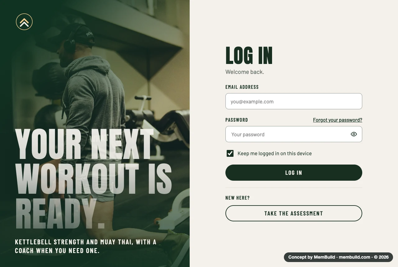
1 of 11Log inBack in, straight to the next workout.Why it is laid out this wayThe form sits on the right with one main button. New visitors get a second button to the assessment, so nobody lands on a sign-up form with no idea which plan fits.
Concept · Log in
Log in screen with a training photo and a big headline on the left, and the email and password form on the right
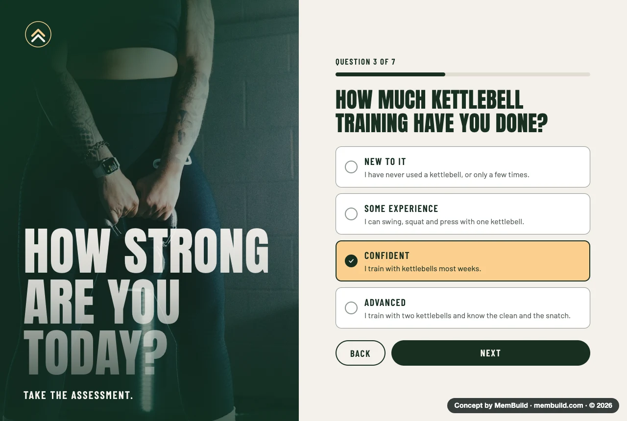
2 of 11Assessment questionOne question at a time, with a progress bar.Why it is laid out this wayEach answer has a short line under it, so people can pick the right level without guessing what the words mean. Back and Next stay at the bottom of every question.
Concept · Assessment question
Assessment question 3 of 7, asking how much kettlebell training someone has done, with four answers and a progress bar
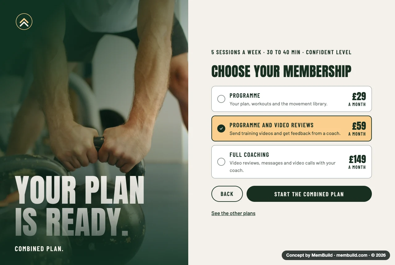
3 of 11Plan and membershipThe answers turn into a plan, then a choice of membership.Why it is laid out this wayThe plan comes first, with sessions a week and minutes a day. The three memberships differ by how much coach time they include, and the one the answers point to is already picked.
Concept · Plan and membership
The recommended plan with three memberships to choose from, the middle one picked
Part 2 of 3 · 5 screens

Training

A normal training day.

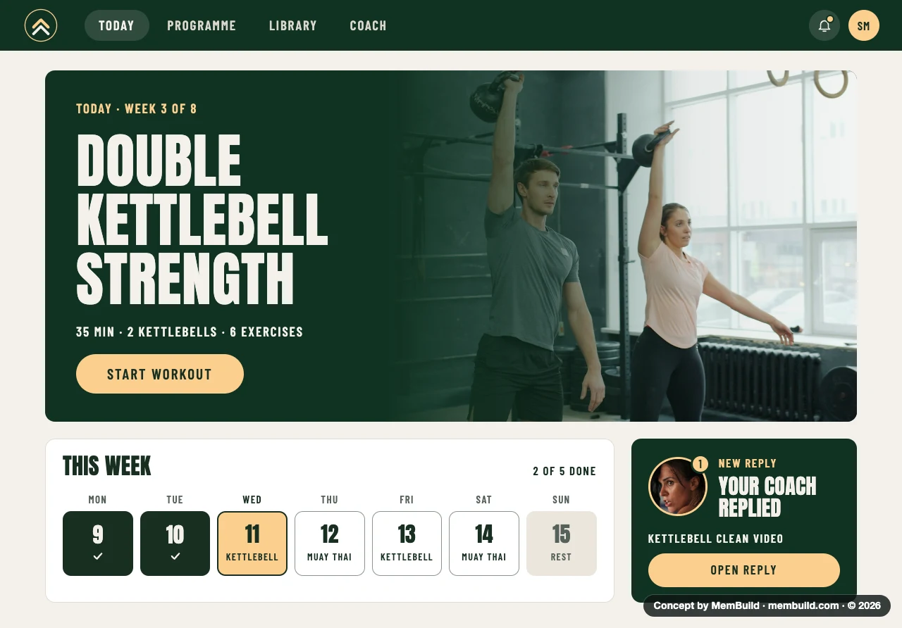
4 of 11TodayWhat to do today, and how the week is going.Why it is laid out this wayThe workout for today is the biggest thing on the page, with one Start button. The week sits under it, so missed and finished days are easy to see. A coach reply gets its own card so it is not lost in a list.
Concept · Today
Today page with the day's workout in a big banner, the week as seven day tiles, and a card saying the coach replied
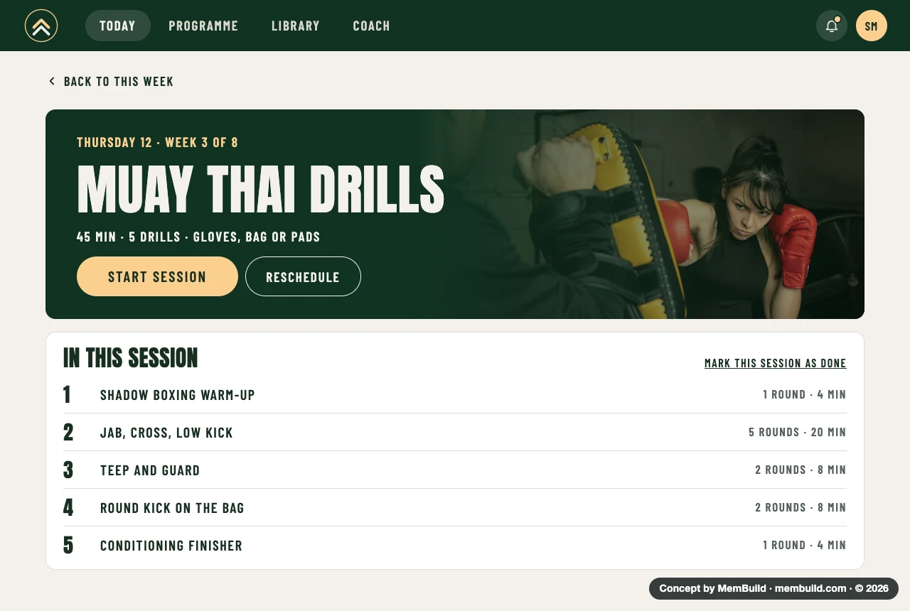
5 of 11Session overviewThe drills in this session, before starting.Why it is laid out this wayEach drill shows its rounds and minutes, so the member knows what the next 45 minutes look like. Reschedule sits beside Start, for days when it does not fit.
Concept · Session overview
Session overview for a Muay Thai day, with a banner, a Start session button and five drills listed with rounds and minutes
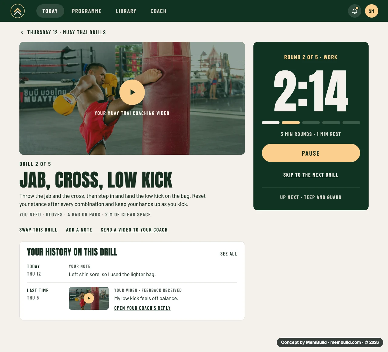
6 of 11Workout with round timerVideo, the drill and a round timer on one page.Why it is laid out this wayThe timer stays on the right while the video and the steps are on the left, so nobody has to switch screens mid-round. Notes and videos from last time sit under the drill.
Concept · Workout with round timer
Workout page with a coaching video, the drill name and steps, a round timer on the right, and past notes and videos for this drill

A long page. Scroll inside the frame to see the rest.A long page. Tap it to see the rest.
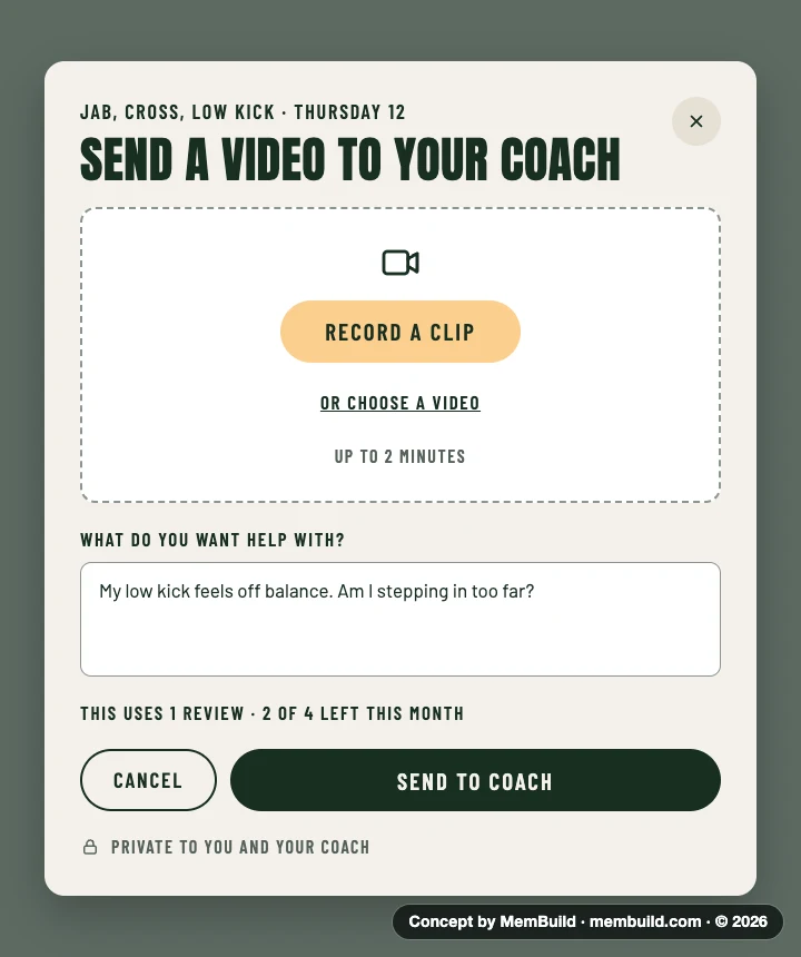
7 of 11Send a videoA short clip and one question for the coach.Why it is laid out this wayThe panel opens over the workout, so the member stays on the drill. It says how many reviews are left this month before they send.
Concept · Send a video
A panel for sending a training video to the coach, with a Record a clip button and a question box
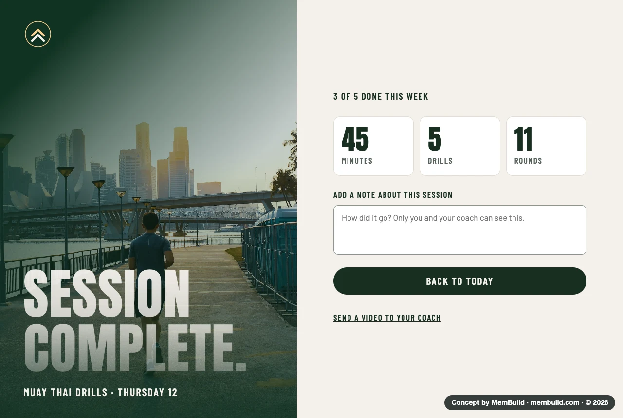
8 of 11Session completeA clear finish, and a place for a note.Why it is laid out this wayThree numbers sum up the session. The note is private to the member and their coach, and sending a video is one link away.
Concept · Session complete
Session complete screen with minutes, drills and rounds, a note box and a button back to Today
Part 3 of 3 · 3 screens

The coach

Messages, video reviews and what changed.

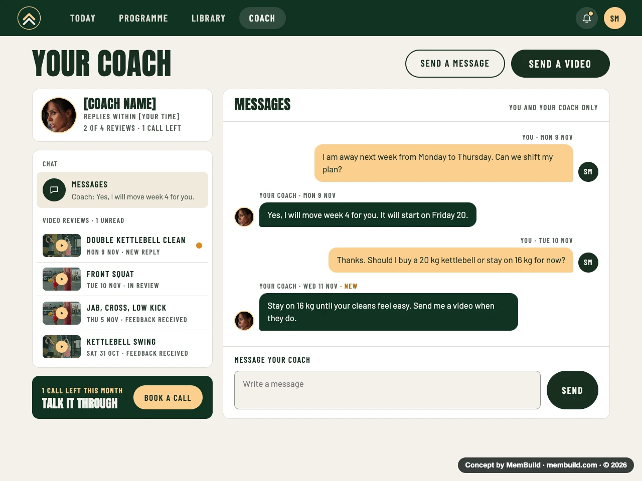
9 of 11Coach pageMessages and video reviews in one place.Why it is laid out this wayMessages and every video review are listed on the left, newest first. The right side shows the open conversation. Calls left this month sit at the bottom, with one button to book.
Concept · Coach page
Coach page with the coach's card, a list of chats and video reviews, and a message thread
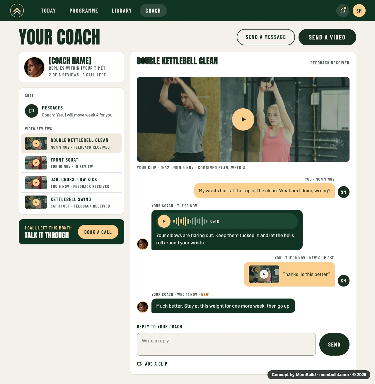
10 of 11Video review conversationOne clip, the coach's answer, and the follow-up.Why it is laid out this wayThe member's clip is at the top, then the conversation under it, like a chat. The coach can answer with a voice note or text, and the member can reply with a new clip.
Concept · Video review conversation
Coach page with a video review open: the member's clip, their question, a voice note and text from the coach, and a newer clip

A long page. Scroll inside the frame to see the rest.A long page. Tap it to see the rest.
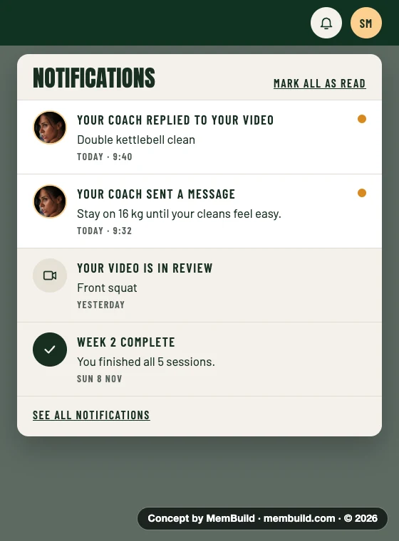
11 of 11NotificationsWhat changed since last time.Why it is laid out this wayNew items have a dot, and coach replies come first. The panel opens from the bell, so the member does not leave the page they are on.
Concept · Notifications
Notifications panel opened from the bell, with coach replies, a video in review and a finished week

Planning something like this?

Tell me where you are, and I will tell you how I would build it.