One learning portal for several training brands
A private place where learners find every course they take, from every brand the company runs, with one login.
 By Danica Louwe
- Drawn 12 November 2026
- 4 screens
- Placeholder names, logos and content
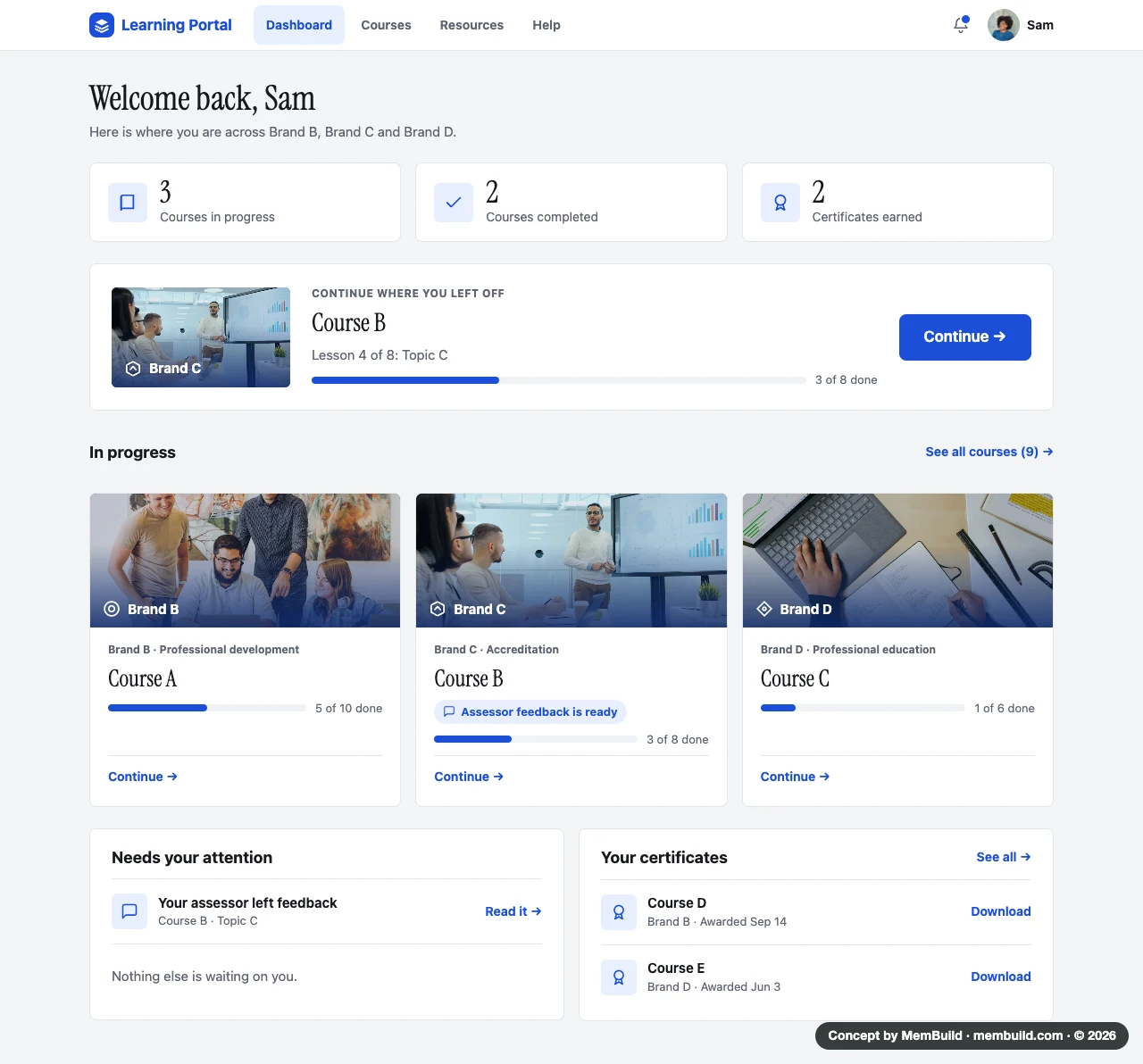
A company with several training brands needs one private place for its learners, including courses where an assessor checks the work.
Who the learners are
Working people who take courses from more than one of the company’s training brands. Some courses lead to an accreditation, so an assessor checks their work before they pass.
They come in between other things, so the first thing they need is where they left off.
One site for each brand, or one portal for all of them?
Separate sites mean separate logins, and progress and certificates spread across them. One portal keeps everything in one place, and each brand still shows its own name and colour on its own courses. That is the one drawn here.
What I decided, and why
One portal, one login
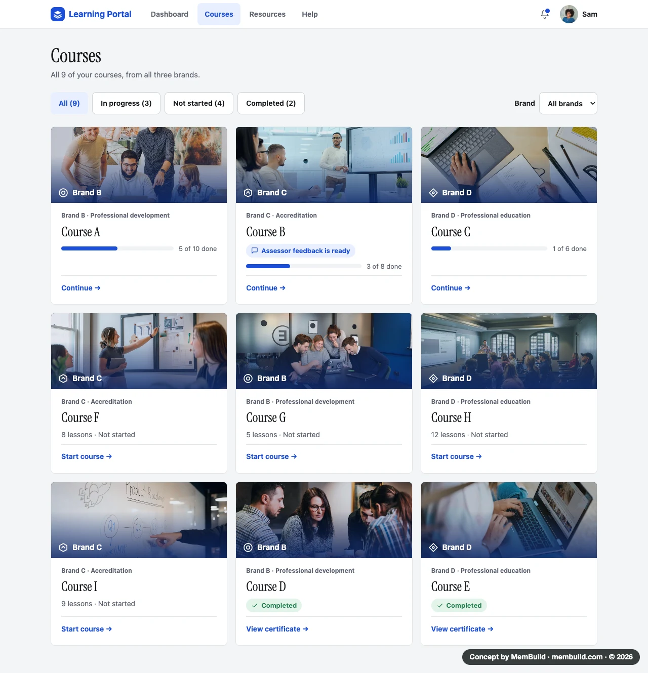
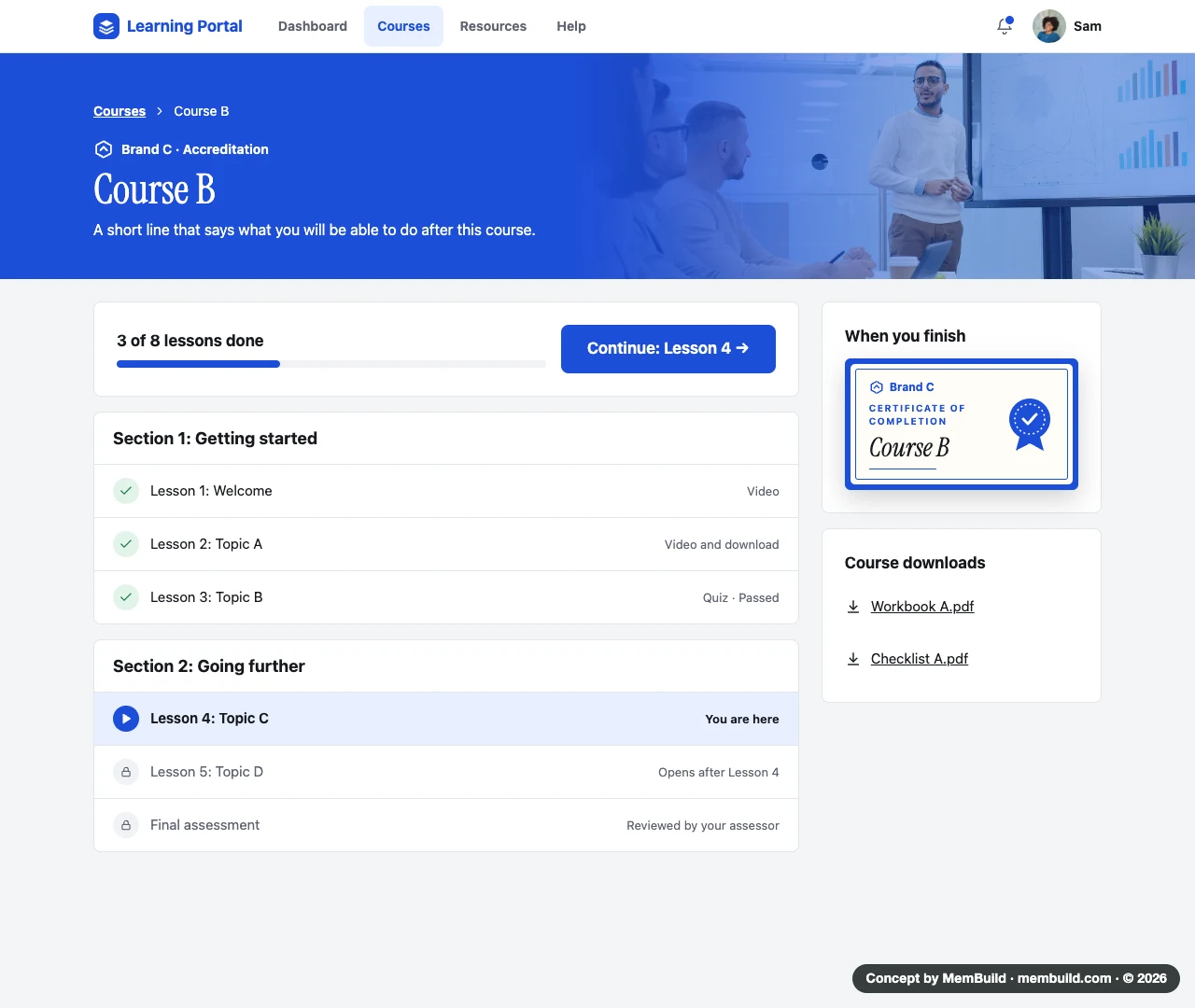
Courses, progress and certificates from every brand live in one place. Learners do not have to remember which site a course is on.
Each brand keeps its name and colour
Every course card carries its brand, so learners still know who a course is from.
The next step comes first
The dashboard opens on the lesson to continue, and on anything waiting, like feedback from an assessor.
Assessed work shows every step
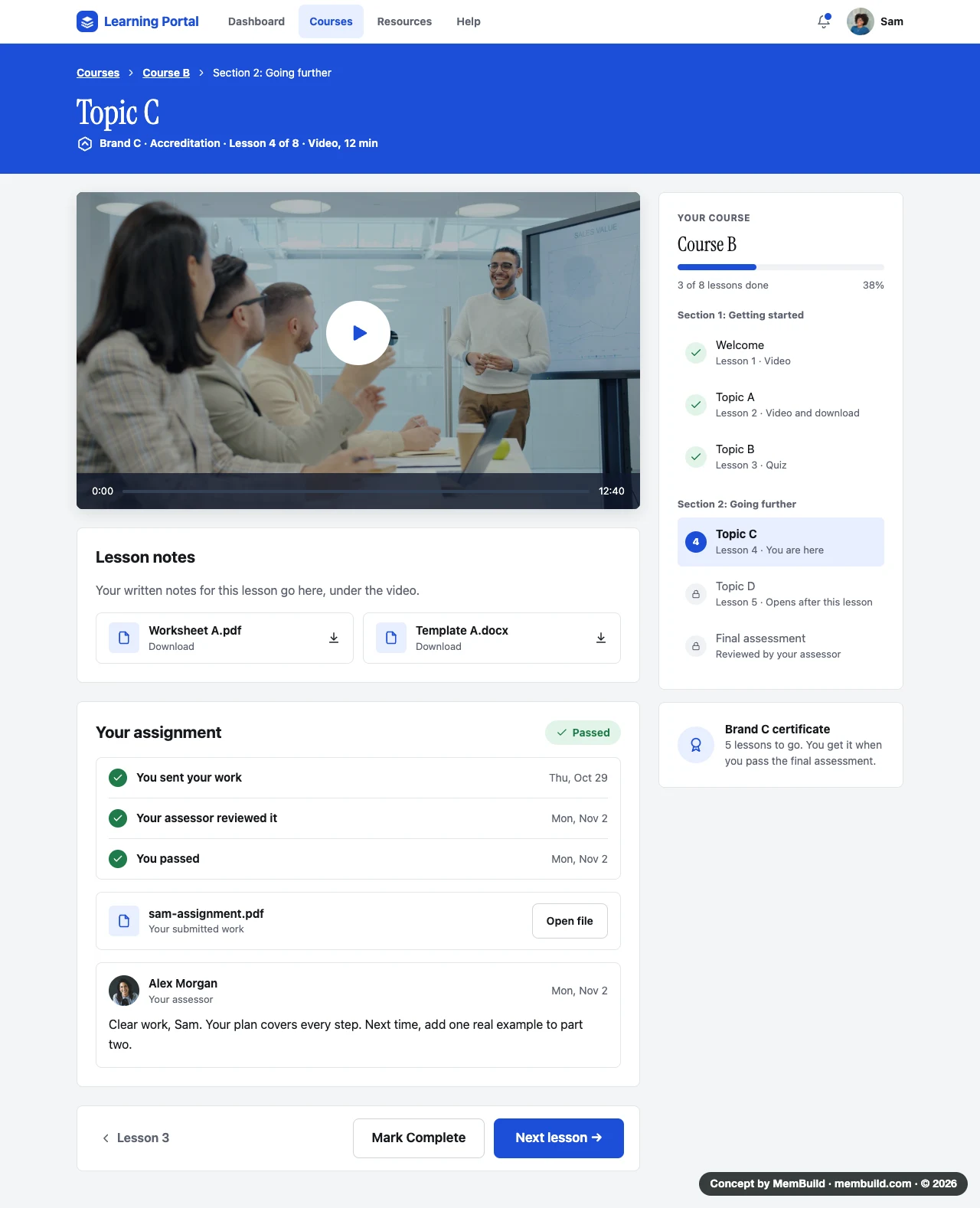
An assignment shows when it was sent, reviewed and passed, with the assessor’s comment under it.
The screens
4 screens, each with a note on why it is laid out that way. Open any screen to see it full size.
Inside the portal
Four screens, in the order a learner meets them.
A long page. Scroll inside the frame to see the rest.A long page. Tap it to see the rest.
A long page. Scroll inside the frame to see the rest.A long page. Tap it to see the rest.
A long page. Scroll inside the frame to see the rest.A long page. Tap it to see the rest.
A long page. Scroll inside the frame to see the rest.A long page. Tap it to see the rest.
Planning something like this?
Tell me where you are, and I will tell you how I would build it.