You’re designing screens before you know how it works.
There’s a theme picked and a Figma file open, but nobody has written down where a member actually goes.
 Danica LouweUpdated 4 min read
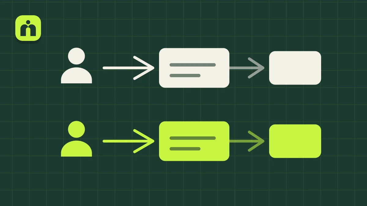
Before you pay for design, draw how the membership works. Start with the simplest version, map visitors and logged-in members, and connect each one to the page they need next. Include what happens after they join and when they come back. Use Miro, Notion or paper. Wireframes come after that, once there’s a plan for them to follow.
It’s hard to design something nobody has defined.
Most new builds start with the look: a theme, a Figma file, or a site someone admires. How the membership really works gets decided later, usually while it’s being built, when changes cost the most.
A famous site sets the bar
A large, polished membership looks like the starting point. It’s the result of years of work, and copying its structure gives you pages you don’t need yet.
Design comes first
Jumping into Figma or hiring a designer before the flow is clear can waste time, and you may not be happy with the result because the thinking hasn’t happened.
The plan lives in your head
If it isn’t written or drawn, your developer has to guess. Every guess is a conversation or a rebuild later.
Only one path gets planned
Owners usually picture a new member. Visitors, returning members and people on a free trial each need something different.
Can you answer these without opening your site?
If some of these make you pause, those are the first things to work out.
- Who arrives on the site, and is each person logged in or not?
- Where does a visitor go first: a landing page, free resources or a sign-up?
- What does someone give you in exchange for free access, such as their email?
- What happens in the first few minutes after someone joins?
- When a member comes back, do they land on a dashboard, their latest progress or a news area?
- Which pages does the first version need, and which can wait?
Draw the simplest version first, then connect the dots.
This is what we ask clients for at the start of a new project. It works in Miro, in Notion or on paper.
- 1
Ignore the fancy sites for now
Start with the simplest version that would work for your members. Doing this also shows you what to set up first, and what you need to research.
- 2
Name your two kinds of people
Draw a box for visitors who aren’t logged in and another for logged-in members. Most sites have more, such as free and paid members, but start with these.
- 3
Connect each one to a page
A visitor might go to a landing page and then registration. A member might go to their dashboard. Draw the arrows, and add new scenarios beside the first one.
- 4
Plan the return visit
Add onboarding for new members, then what happens the next time they log in. This is the part most often left out.
- 5
Collect examples as you go
Screenshot or record sites you like, including each step and any pop-ups. For one demo, we captured how Duolingo walks you through choosing a path and offers its paid version.
- 6
Then wireframe
Once the content and flow make sense, move to layouts in Figma or hand the map to your developer. The design now has something solid to follow.
Watch it done
Drawing the first map on a whiteboard: who arrives, where each kind of person goes, and why design comes after that.
Questions owners ask
Which tool should I use?
Whichever you’ll actually open. We use Miro for the map and Notion for notes, but paper works too. When it’s ready for a developer, take a photo. A whiteboard tool just makes it easier to update when the plan changes.
When should I hire a designer?
After the map exists. Our team only starts wireframes in Figma once the content and flow are defined. A designer who has that map is solving your real problem, not guessing at it.
I already have a site. Is it too late?
No, and it’s often easier. We can see what you have and what you were trying to do. Map how it works today, mark where people get stuck, then decide what to restructure.
How detailed does the map need to be?
Detailed enough that someone else could follow it. Each kind of person, where they start, what they do next and what they see when they come back. Leave colours and layouts out.
Is it okay to copy another membership site?
Learn from it, but don’t copy it. Take screenshots of the steps you like and note why they work. Then decide what suits your members, because a famous site’s structure was built for a different audience and a bigger team.